How to Create a CSS Only Floating Label for Input Fields
written by Idriss Douiri
3 min read
Floating input labels are used in many User Interfaces, especially by Google. This article will focus on how to make them in pure CSS.
What is a floating label?
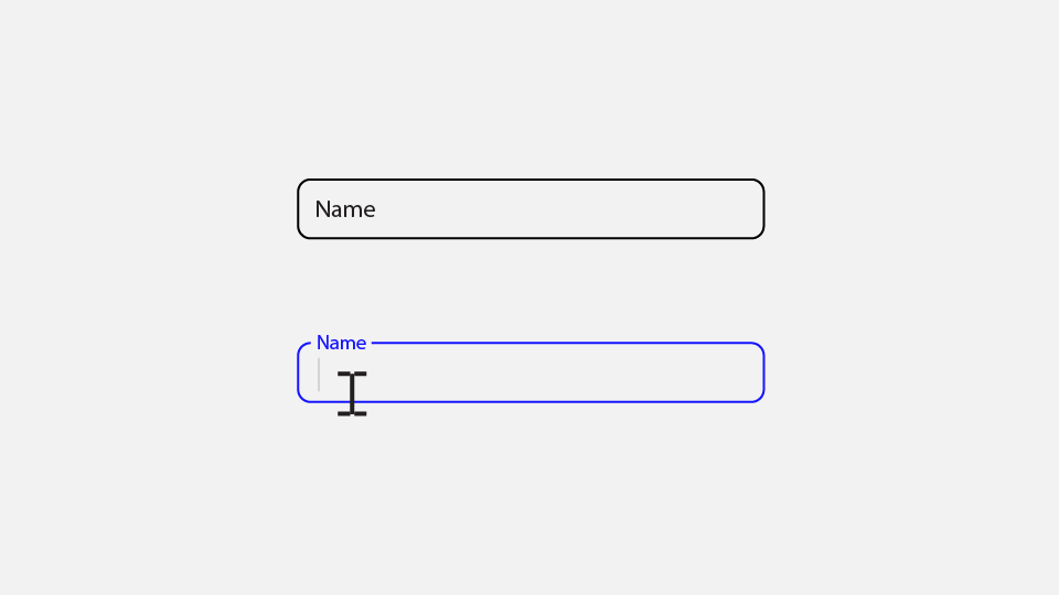
A floating label is a UI design pattern used in form fields where the placeholder text moves or floats above the input field when it is focused or contains text. This pattern was introduced as a component of Google’s Material Design guidelines, which aim to create consistent UX across different platforms.
Try this demo:
Why Floating Labels?
Floating labels come with many advantages and solve many UI problems, including:
- Accessibility: ensuring labels are always visible to the user.
- Clarity: floating labels use less space and make your design look clean and modern.
Setting Up the HTML
The markup will vary depending on the method you choose to style it (e.g., using the :has() selector, anchor position, etc…), for me I will go with this structure as I put the label after the input so I can target it in CSS using the sibling selector while using the for attribute to link them.
<div class="form-group">
  <input type="text" id="name" placeholder="Name">
  <label for="name">Name</label>
</div>
A label is acceptable to be positioned before or after the input field, as stated in the HTML4 specification.
”The label itself may be positioned before or after the associated control” — W3C HTML4 Specification.
Adding CSS Styles
the label needs to scale down and move up when the input is focused or filled, to reach that we need to follow these steps:
step 1: Hide the placeholder as we will use the label instead.
input::placeholder {
	opacity: 0;
}
step 2: position the label inside the input.
We can use position: absolute to place the label inside the input field, and it is important to disable its pointer events to prevent interference with the input.
.form-group {
  --pad: .75rem;
  position: relative;
}
label {
  position: absolute;
  left: var(--pad);
  top: var(--pad);
  pointer-events: none;
}
step 3: Detect if the input is focused and the placeholder is not shown.
we can check if the input contains a text by checking if the placeholder is visible or not using the :placeholder-shown, and for the focus stat we can use :focus pseudo-class.
We can then access the label using the next-sibling combinator(+) as the label follows the input in the HTML structure.
input:focus + label,
input:not(:placeholder-shown) + label {
   /* style when the input is filled or focused */
}
step 4: transform the label when the input is focused or filled.
Play around with the transform property to match your desired outcome, I found this transformation to work well with me
input:focus + label,
input:not(:placeholder-shown) + label {
  transform: translateY(calc(-50% - var(--pad))) scale(.8);
  color: var(--accent);
}
Complete Example
Continuing from the steps above, here is what I have come up with. But you are not limited to these options:
See the Pen floating label CSS only by Driss (@driss-d) on CodePen.