 Idriss Douiri
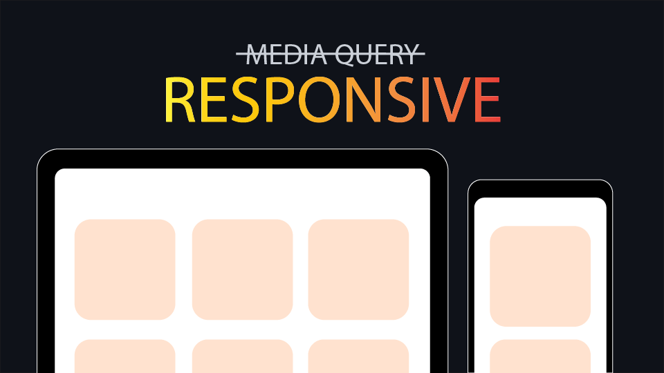
Media queries are essential for building responsive websites, but sometimes, we can achieve the same result without them. This article will cover how to write fewer media queries when you don’t need them, taking advantage of some CSS properties.
Responsive Typography
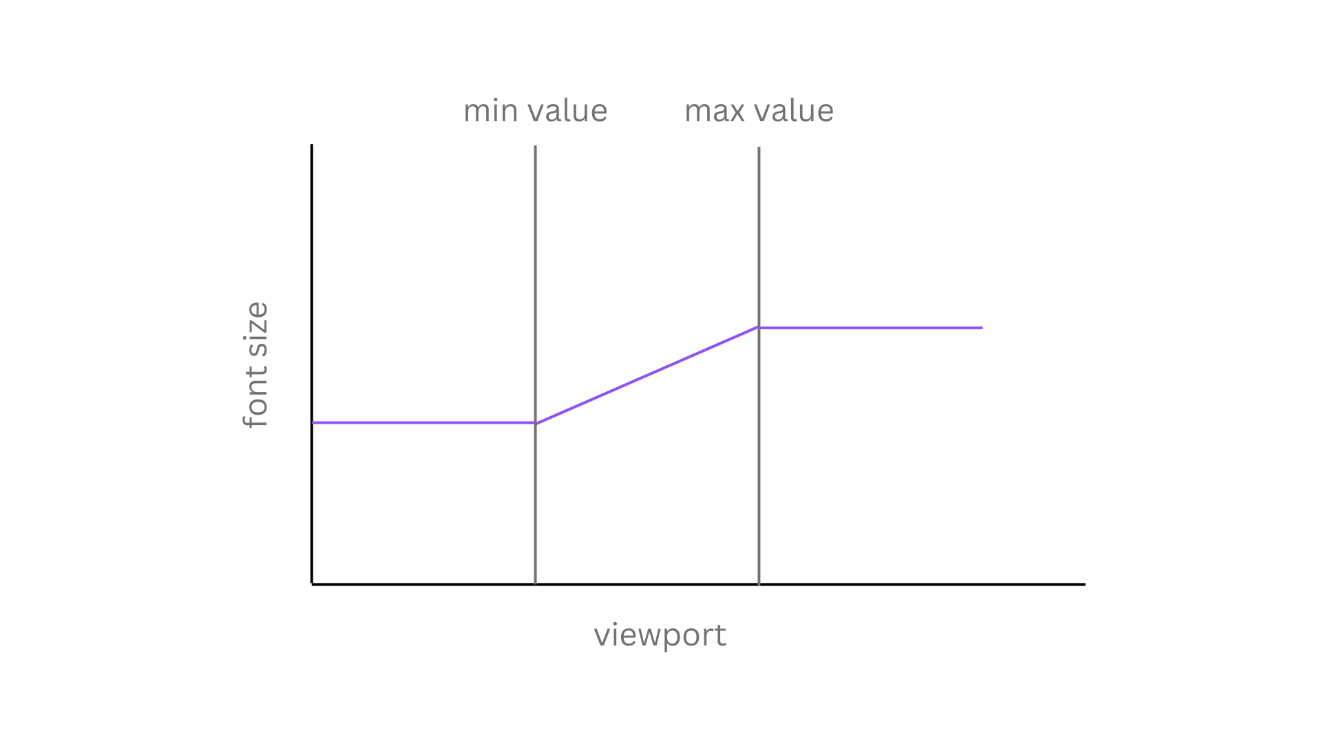
Your text size should adjust to different screen sizes (for example, from 14px for small screens to 18 for larger screens), and relying on fixed breakpoints for font size shifts isn’t the optimal approach. Instead, you can make your font smoothly scale between a minimal and maximum value relative to the viewport with the help of the CSS clamp() function.
clamp([min value], [preffered value], [max value])h1 {
font-size: clamp(1.5rem, 2vw + 1rem, 2.25rem);;
}In this example, the font size will grow and shrink as the viewport changes but never exceeds the maximum value or goes below the minimum one.
For more details about how this works, read this article.
Responsive Grid
You can make your grid container decide how many columns to have automatically based on the space it has and the width of its children using the auto-fit and auto-fill keywords within the repeat() function.
.grid-contianer {
  display: grid;
  gap: 1rem;
  grid-template-columns: repeat(auto-fill, minmax(min(100%, 250px), 1fr));
}
You can use either auto-fill or auto-fit. Both are similar, the only difference is that auto-fill will fill all the space with columns, while auto-fit will stretch the items to fit in the columns. Here is a visual explanation to see the difference between these keywords:
Read this article for more in depth explanation.
Responsive Flex
When setting the display property to flex, the items inside that flex container come next to each other with no wrap, causing an overflow, but you can make your items wrap to a new line by changing flex-wrap from no-wrap to wrap, making it responsive to all sizes.
.tags {
  display: flex;
  flex-wrap: wrap;
}
Responsive width
Having a fixed width for your container on every screen size breakpoint is unnecessary. Instead, you can utilize either a max-width property or the min() function as a value of the width.
.container {
  max-width: 900px;
  /* width: min(100%, 900px); */
}
Responsive Images
By default, images won’t shrink to fit their container, leading to overflow issues when the image is too big. That’s why you will find most people use this global reset to allow the images to scale down when not enough space is available while maintaining the same aspect ratio.
img {
  max-width: 100%;
}