 Idriss Douiri
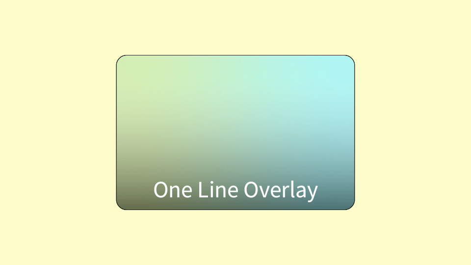
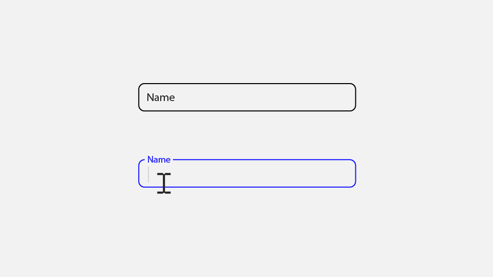
In many scenarios, we end up having text on a background image in our design, and depending on the image colors, the text might not be obvious and can be hard to read. That’s where having an overlay can add a layer of contrast, making it readable no matter how bright the background is.
Traditionally, various methods have been used to create overlays, such as employing a div or a pseudo-element. These methods are fine but they require a lot of boilerplate code for such an unnoticeable effect, while you can do it with single line of CSS using the border-image property.
Why use border-image as an overlay?
border-image is a CSS property that draws an image around an element.
border-image works well as an overlay because it gets painted between the background and the content which is what we want.
border-image Syntax
border-image: <source> <slice> / <width> / <outset> <repeat>;This syntax might look complex because it’s a shorthand for 5 properties, but only border-image-source and border-image-slice are required to achieve an overlay effect.
Using Border-Image as an Overlay
Let’s see how to create an overlay with border-image to improve the readability of this text:

First, we need to set the border source. Which is the image we want to use as an overlay. For that, we can use a simple linear-gradient as it is an image.
.overlay {
  border-image-source: linear-gradient(#0003, #0004);
}
This will create a gradient with a semi-transparent black. You can use any gradient with any colors you want. To achieve a solid color, repeat the same color twice (e.g., linear-gradient(red, red)).
Finally, we need to set how we want to slice the image. The image can be divided into nine regions for the border to use. In this case, we only care about the middle region which can be controlled with the fill keyword while using 0 for the other regions.
.overlay {
  border-image-source: linear-gradient(#0003, #0004);
  border-image-slice: 0 fill;
}
border-image-slice is a complex and hard-to-explain property, play around with this tool by mdn to better understand it.
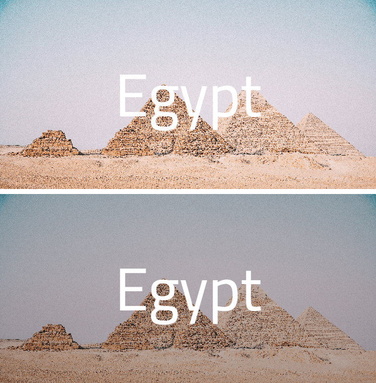
Now that the overlay is working, here’s a comparison between text placed on a background image with and without an overlay. Notice how the overlay enhances the text readability, providing a clear contrast against the background.
We can combine those two lines into one using the border-image shorthand property as follows:
.overlay {
	border-image: linear-gradient(#003, #0004) 0 fill;
}