How to Make an Inverted border-radius in CSS (with diagrams)
Written By  Idriss Douiri
5 min read
When I was building an inverted border-radius generator, I discovered that creating this seemingly simple effect involves multiple approaches, each with distinct trade-offs between simplicity, browser support, and visual flexibility.
Here’s everything I learned about creating inverted borders, with the pros and cons of each technique.
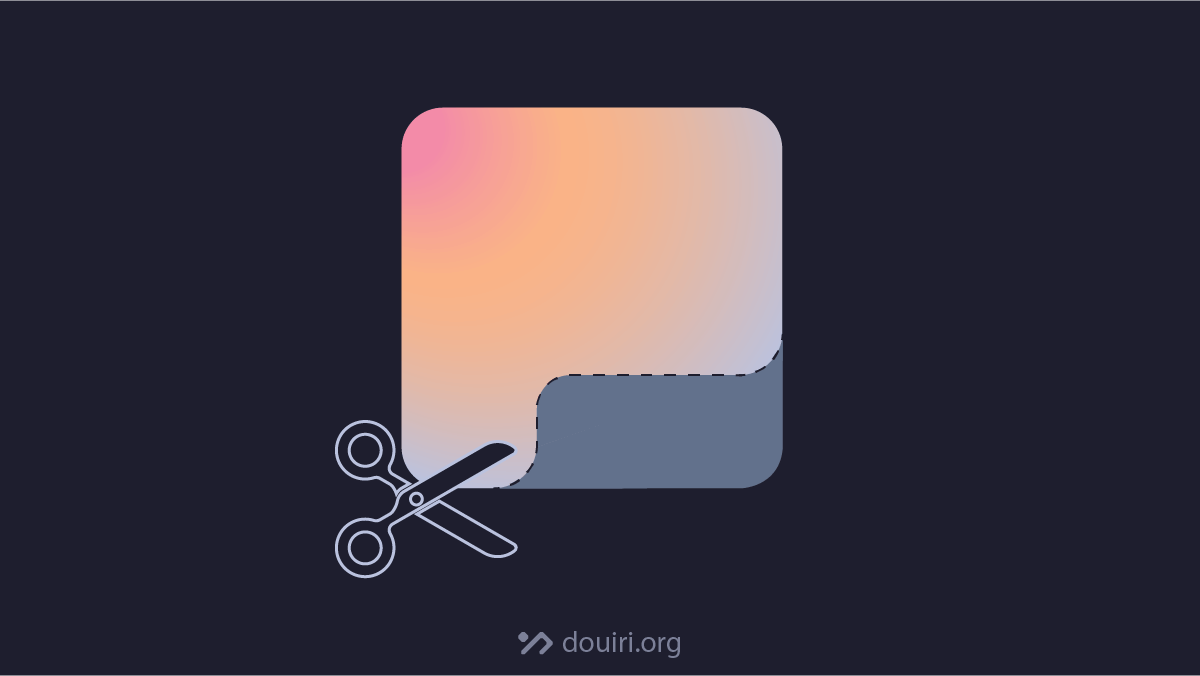
What is Inverted Border-Radius
Inverted or negative border-radius is a modern web design with concave corners that curve inside the box instead of around it.
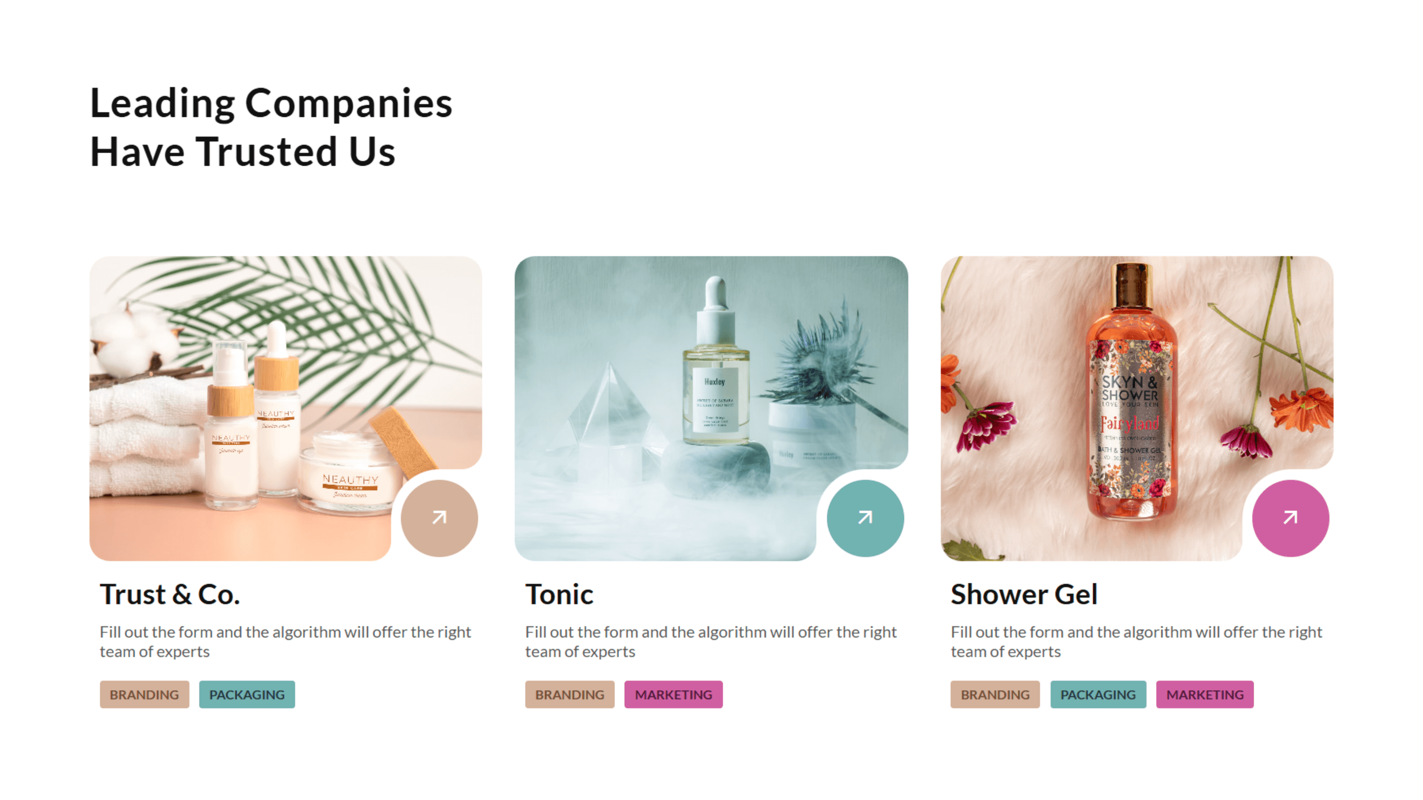
This modern UI effect can be found everywhere around the web:
How to make an Inverted border-radius?
Making inverted corners can be achieved with one of these 3 options:
- Using other HTML elements and pseudo-elements.
- Using the CSS clip-path property
- Using a mask image layer.
Using Multiple Elements
Using other elements to hide some parts of the main element is the obvious approach that comes to mind for this effect.
It works by placing other elements or pseudo-elements on the corners you want to cut, as shown below:
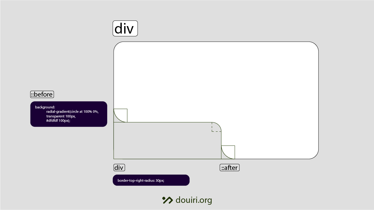
This works well on solid background colors and allows for a fluid container inside the cropped area, which adapts to the content inside it.
This method doesn’t support gradient or image backgrounds, as it requires you to paint the area you want to cut off with the same color as the background to make the illusion of inverted borders, which doesn’t apply to gradient backgrounds.
Using the CSS clip-path Property
Clip-path’s job is to crop elements to a predefined shape that fits on any background, which is what we want.
Its wide browser support gives it an advantage for this effect. However, the basic shapes we use mostly with clip-path, like circle() and polygon(), won’t be useful in this case; instead, we need to work with other functions
Using Custom ClipPaths with url()
For this option, we need to create a custom SVG <clipPath> and reference it in CSS using the clip-path’s url() function.
This path must include normalized values that range from 0 to 1, and be wrapped inside an SVG <clipPath> element with the attribute clipPathUnits="objectBoundingBox". This is required for the clipping area to be responsive and work on any dimensions.
Here is what a custom clip path will look like:
<svg xmlns="http://www.w3.org/2000/svg">
 <clipPath id="clip" clipPathUnits="objectBoundingBox">
    <path d="M0.2,0H0.3...0Z"/>
 </clipPath>
</svg>
You can then reference its ID in your CSS using the clip-path’s url() function, similar to this:
clip-path: url("clip");Custom SVG path using the path() function
You can also extract the SVG path’s d attribute value that defines the clipping area of the inverted shape and insert it directly into the clip-path’s path() function. This approach eliminates the need for external SVG files or data URIs.
clip-path: path("M45,0H118A12,12 ... ");However, this method comes with a significant limitation: the path coordinates you define inside path() are absolute values, meaning the clipped area will remain fixed at its original size regardless of how the element scales. Unlike mask images or SVG-based clip paths that automatically adapt to their container, the path() function doesn’t provide inherent responsiveness, potentially causing the inverted border to appear distorted or improperly positioned on different screen sizes.
clip-path’s new shape() function
The new shape() function addresses the scalability limitations of the path() function in clip-path by supporting relative values with percentage units and provides access to CSS math functions like calc(), abs(), max(), and others. This enables truly responsive clipping paths that adapt to element dimensions.
Shape()‘s syntax differs significantly from SVG path notation; it uses human-readable commands. For example, here’s how to create a triangular clipping region using shape():
clip-path: shape(from 0% 0%, line to 100% 0%, line to 50% 100%, close);This declarative syntax is more accessible than SVG path coordinates, making it easier to understand and modify. However, shape() currently has very limited browser support and isn’t production-ready, so it remains a promising future solution rather than a current alternative for inverted borders.
Browser Support:


Using CSS Mask Image
A mask image is a layer that defines the visible and hidden areas within an element, where transparent areas are hidden.
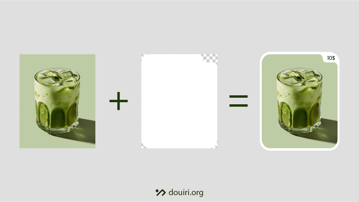
The great thing about masks is their ability to preserve semi-transparent areas, allowing for softer edges and gradual transitions. Additionally, mask images automatically scale with the element’s dimensions, making them highly flexible for responsive designs.
We can use masks for inverted borders by creating an SVG or PNG image with the desired inverted shape and referencing it in the CSS mask property using the url() function.
div {
 aspect-ratio: 16 / 9;
 mask: url('data:image/svg+xml,...') no-repeat center / contain;
}
When using aspect-ratio, the mask will maintain correct proportions as the element resizes, ensuring the inverted border pattern remains visually consistent across different screen sizes:
Essential Tip
When using CSS-based methods like clip-path or mask for inverted borders, always consider adding an aspect-ratio property to your element. This ensures your inverted shapes maintain their intended proportions across different screen sizes and prevents distortion when elements resize:
.inverted-border {
 aspect-ratio: 16 / 9; /* or whatever ratio suits your design */
 clip-path: url("clip");
}
Conclusion
Mastering inverted borders opens up new creative possibilities for web design, from subtle corner details to bold geometric shapes. Whether you choose clip-path precision, mask image flexibility, or hybrid approaches, the key is experimentation. Try different techniques, test across devices, and don’t be afraid to push creative boundaries. Your users will notice the extra attention to detail, and these finishing touches often make the difference between good design and great design.